Dashboard Overview
The Dashboard Overview is the central navigation view. It opens directly after Login Options and shows the general navigation and an overview of all Dashboards.
After login it is available via the Overview button in the left
sidebar ( ).
).
Title Bar
The title bar of the Dashboard Overview displays the local browser time, an icon for the current connection state and the logged in user. The user icon can be opened to check the user permissions and to log out of the Dashboard.
Navigation
The navigation sidebar is always visible on the left side of the browser. The dashboard view itself can be reached via the WinCC OA icon on the top. Beneath that, up to 4 dashboard navigation icons can be placed to easily open the dashboards marked as favorites. The arrow button below logs out the current user and returns them to the login-screen. The navigation sidebar can be expanded to include titles with the "expand" button on the bottom left.
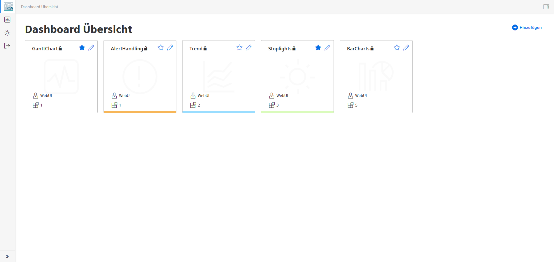
Main Dashboard Overview
This view shows all Dashboards available to the current user in the current project. The individual Dashboards are represented by tiles containing specific information and individual controls.
New dashboards are added with the Add Dashboard button to the right. This will immediately open the relevant Dashboard Settings page.
Dashboard Icon Tiles
Each Tile represents one dashboard and shows its title and description. Clicking the Tile opens the dashboard in its standard Dashboard View mode. The favorite button adds the dashboard symbol in the navigation sidebar for quick access. The edit button beside it opens the edit menu for Dashboard Settings. The information block at the bottom shows the user who created the dashboard and the amount of widgets contained in it. The colored bar at the bottom edge of the icon shows the background color set for the dashboard. The symbol associated with the dashboard is shown in the background.
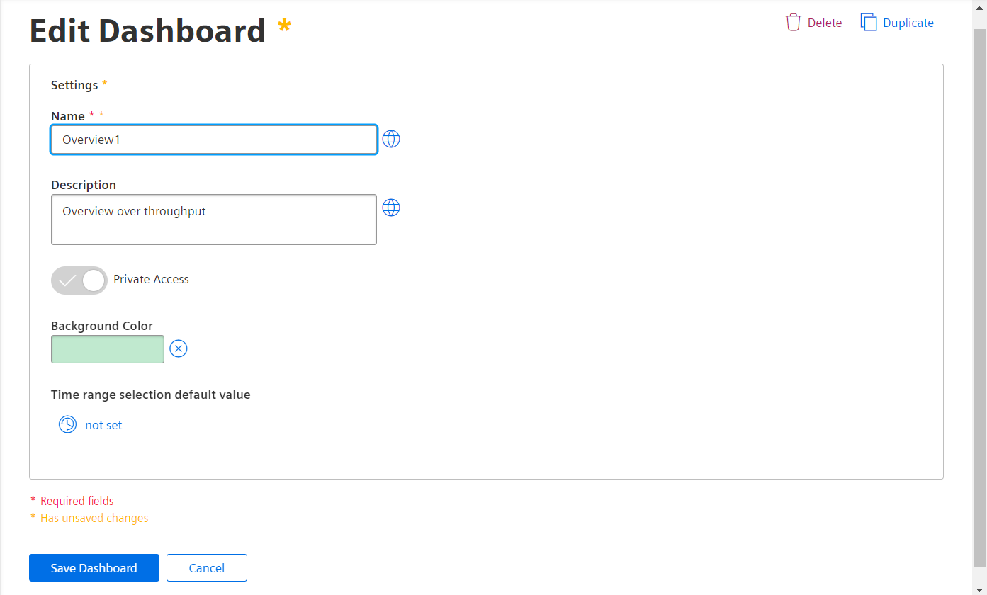
Dashboard Settings
The Dashboard Settings will open automatically upon adding a new dashboard. Here the user can edit the title and description in all available project languages. One of the buttons to the right is used to delete the board, while the other button places a duplicate in the overview. Via the slider, the dashboard can be set to private view, making it only visible to the user who created it. The background color for the dashboard is set with a color-selector. The "Time range selection default value" lets you choose a value to be set as default for time ranges within the dashboard.
Dashboard Edit View
Individual Dashboards are created in the "Edit" View.
It is activated by clicking the Edit Widgets button on the right side of the standard Dashboard View. If the user does not have access, or the edit view was deactivated at login, the edit view will not be activated and the widgets remain in the view only mode.
Already placed widgets can be moved freely by clicking the grid-icon in the top right corner. New widgets can either be added with drag & drop or they are via the side menu, after which they are placed in the free space automatically. The button on the top left of the widget will allow you to delete it or open the associated settings menu.
The "Expand" button in the top right corner of the edit view will open or collapse the side-menu containing the Data Selector and the Widget Selector.
Further Information about the Data Selector.
Further Information about Widgets.