Fill-pattern string
The fill pattern defines the way in which rectangles, circles, ellipses and polygons are filled, how simple texts are underlaid or which picture is loaded into a button. The fill-pattern string can be comfortably generated with the fill type selector. This selector is available in most menus under "tools" or directly in the filling property of the graphics object.
A fill-pattern definition in WinCC OA has up to four different parameters.
Syntax
"[Pattern type,[Parameter2,Parameter3,Parameter4]]"The fill-pattern string must not contain any spaces. Spaces after commas, for instance, will mask the associated parameter.
Depending on the type of pattern used the syntax of the fill-pattern string changes:
| Pattern type | Description |
|---|---|
| solid | The solid type means a completely filled object. |
| outline | The outline of the object can be seen. |
| pattern | The image specified will be set as pattern and placed according to the given parameters. |
| hatch | The object will be filled with a hatching in the style defined by the given parameters. |
| gradient | The object will be filled by a color gradient defined by the given parameters. |
Solid
The graphics object is filled by the color specified in the BackColor property. The pattern type is the only parameter used.
Syntax
"[solid]"Outline
Only the outline of the object can be seen. The ForeColor defines the color of the outlinewhile the BackColor is set to transparent. The pattern type is the only parameter used.
Syntax
"[outline]"Pattern
A picture is set as filling for the graphics object.
Syntax
"[pattern,[<Fit>,<Picture type>,<File name>]]"| Parameter | valid values | Comment |
|---|---|---|
| Fit | center | The picture is loaded in the center (only available for tables) |
| fit | The function loads the image to the center of the button and scales the image to fit the available area | |
| tile | Multiple occurences of the selected picture are arranged side-by-side to fill the space (not available on buttons) | |
| fit_keep_ratio | The picture is scaled to the button size, but keeps the original image ratio (only available for vector graphics on push buttons) | |
| Picture type |
The picture format is detected automatically. The parameter is set to "any" by the fill type selector. The available formats for Pictures: Pixel formats: "bmp", "cur", "gif", "icns", "ico", "jpeg", "jpg", "pbm", "pgm", "png", "ppm", "tga", "tif", "tiff", "wbmp", "webp", "xbm", "xpm" Vector formats: "emf", "svg", "svgz", "wmf", See chapter Graphical design of panels for further details on the graphic formats. |
|
| File name | <File name> | File path for the picture (a relative path definition refers to the directory <proj_path>/pictures) |
If the picture is not located in the pictures directory of the project the absolute path is needed for it to be found.
In case of primitive graphics objects (rectange, polyline, ellipse, ect.) and buttons, a picture saved in a pixelformat is grayed out automatically when the object is disabled. However, vector formats are not changed when the object is disabled.
![]() Example
Example
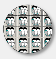
A circle is filled with tiled PNG graphics from the file /pictures /PVSS.png:
main()
{
  setValue("ELLIPSE1", "fill", "[pattern,[tile,any,PVSS.png]]");
}
Hatch
With this pattern type a graphics object is filled with a hatching. The color used for the hatching is specified in the BackColor property.
Syntax
"[hatch,[<Hatching type>,<Grid spacing>,<Orientation>]"| Parameter | valid values | Comment |
|---|---|---|
| Hatching type | ||
| cross | cross-hatched | |
| parallel | parallel | |
| Grid spacing | ||
| - |
obsolete parameter hatching distance is always a fixed size |
|
| Orientation | ||
| left | left | |
| right | right | |
| horizontal | horizontal | |
| vertical | vertical | |
![]() Example
Example
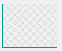
A rectangle is filled with inclined cross-hatching:
 main()
{
  setValue("rectangle1", "fill", "[hatch,[cross,,right]]");
}
Gradient
The graphics object is filled with a color-gradient. This property is best set with the graphical interface provided by the fill type selector.
Syntax
"[gradient,[<Gradient type>,<Spread>,<Orientation>]"| Parameter | valid values | Comment |
|---|---|---|
| Gradient type | ||
| linear | linear gradient fill | |
| radial | radial gradient fill | |
| conical | conical gradient fill | |
| Spread | ||
| pad | The gradient fill will be displayed on the whole area | |
| repeat | The gradient fill will be repeated multiple times over the whole area | |
| reflect | The gradient fill will be repeated in the inverted order | |
| Orientation | ||
| A string of parameters defining the colors of the gradient and their orientation. This is best defined in the fill type selector. | ||
If a gradient is defined for an object, the background color (backCol) cannot be changed via CTRL.
![]() Example
Example
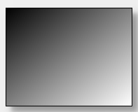
A linear gradient fill from black to white is set.
main()
{
  setValue("RECTANGLE1", "fill", "[gradient,[linear,pad,0.0,0.0,1.0,1.0,0.0,{0,0,0},1.0,{255,255,255}]]");
}


