Trend examples in WinCC OA Excel Report
Examples of line charts
The following set of illustrations are examples for possible chart designs.
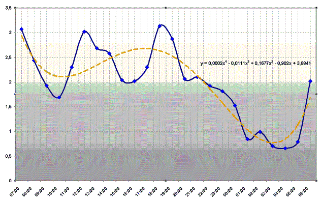
The screenshot Water supply report - trend line shows a template file "water_supply.xlt" containing a trend line and its mathematical approximation as a fourth order polynomial (best fit). This type of "trend line" can be calculated in Excel. You do not have to display the automatically calculated formula - it is optional!
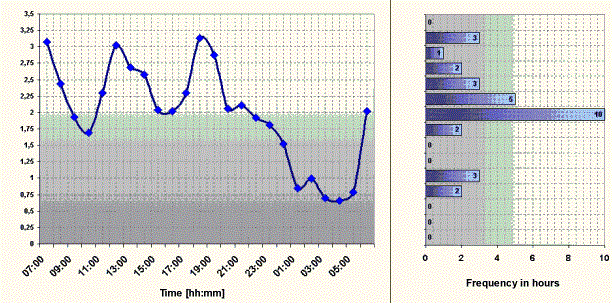
The consumption history for the water supply system is displayed in the Trendline-Frequency diagram.